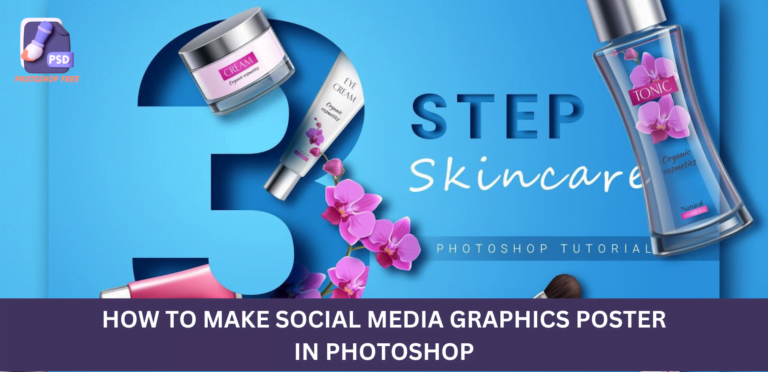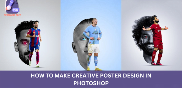
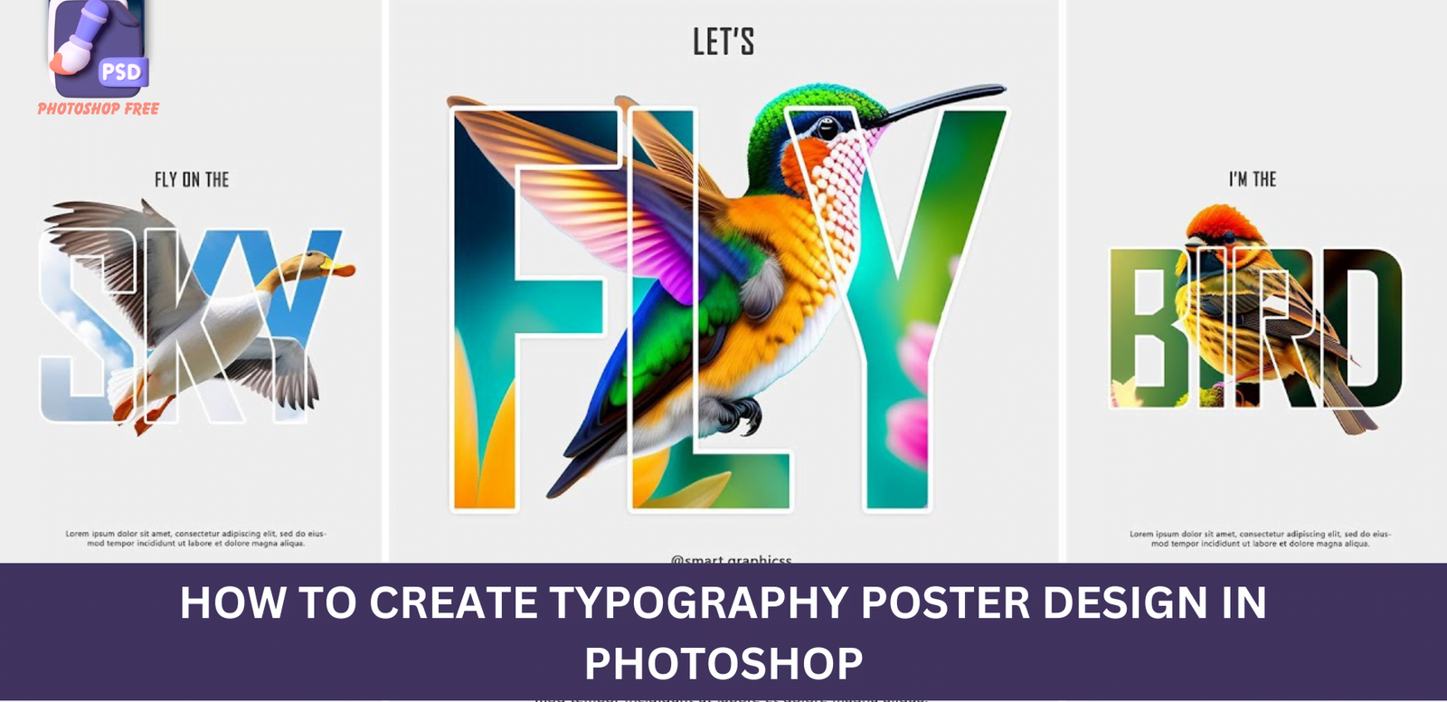
How to create Typography Poster Design in Photoshop : Solid Colour Adjustments for Stunning Visuals
Typography Poster Design in Photoshop : In the ever-evolving landscape of digital content creation, the ability to enhance and optimize visuals is a skill every designer and content creator should possess. One powerful technique in this realm is the use of solid colour adjustments layers. In this comprehensive guide, we will delve into the intricacies of creating visually stunning content by mastering the art of solid colour adjustments.
Keep visiting Photoshop Free. for latest updates and Tutorials.
Typography Poster Design in Photoshop Video Tutorial
Choosing the Perfect Hue
The first step in your journey to captivating visuals is to create a solid color adjustments layer. This layer allows you to choose any color that aligns with your brand, message, or aesthetic preference. Click OK, and voila! Your canvas is now imbued with a fresh, vibrant hue that sets the stage for an eye-catching design.
Typography Magic: Finding the Ideal Font
Now that your canvas is awash with a mesmerizing color, it’s time to add textual elements. The font you choose plays a pivotal role in conveying your message effectively. For this guide, we recommend the exquisite [Font Name]. You can find the download link in the description, ensuring you have access to the same artistic tools that professionals use.
Image Integration: Blending Text and Visuals Seamlessly
To truly elevate your design, you need to integrate captivating images. Begin by inserting your chosen image onto the canvas. To maintain a harmonious balance, decrease the image opacity until the text becomes visible. Press Ctrl+T for free transform, allowing you to adjust the image size and position with precision.
Creating Depth: The Clipping Mask Technique
To add depth to your composition, create a clipping mask. Right-click on the image and choose “Create Clipping Mask.” This simple step ensures that your image interacts seamlessly with the solid color adjustments layer, creating a visually cohesive masterpiece.
Doubling the Impact: Duplicate and Subject Selection
Duplicate the image by pressing Ctrl+J, a technique that intensifies the visual impact. To further enhance your composition, go to the Select menu and choose “Subject.” This step is crucial in isolating the subject of your image, emphasizing key elements.
Text Layer Enhancement: Crafting Dimensional Typography
To achieve a layered and dimensional look, it’s time to enhance the text layer. Duplicate the text layer and place it atop all layers. Decrease the fill to zero percent, allowing the underlying color to shine through subtly. This creates a nuanced visual effect that captivates the viewer.
Unleashing Style: Blending Options for Text
Open blending options for the text layer and choose “Stroke.” Apply the following settings to add a stylish outline that makes your text pop. Additionally, opt for a drop shadow by copying the specified settings, contributing to a polished and professional appearance.
Crafting the Finishing Touch: Adding Additional Text
With the groundwork laid, it’s time to add the finishing touch by incorporating additional text elements. This step allows you to convey your message comprehensively, ensuring that your audience is engaged from start to finish.
Conclusion: Elevating Your Visual Content Game
In conclusion, mastering solid colour adjustments is a game-changer in the realm of visual content creation. From choosing the perfect hue to blending text and visuals seamlessly, each step contributes to a captivating and professional design.